" height="98.74103128328082px" id="jhhGYPQrQ" transform="translate(10.248 21.259)" width="57.50427841186523px"/><path d="M 50.17 1.07 L 49.98 15.06 L 47.16 13.98 L 47.3 10.9 L 42.68 9.12 L 40.64 11.47 L 37.91 10.42 L 47.39 0 L 50.18 1.07 Z M 47.38 8.62 L 47.59 3.54 L 47.56 3.54 L 44.19 7.39 L 47.39 8.62 Z M 61.71 8.41 L 59.1 18.44 L 59.13 18.47 L 65.56 12.4 L 67.44 14.35 L 57.85 23.4 L 55.84 21.32 L 58.45 11.32 L 58.42 11.29 L 52 17.35 L 50.12 15.4 L 59.71 6.35 L 61.71 8.42 Z M 73.03 26.14 C 73.29 26.94 73.4 27.73 73.37 28.51 C 73.33 29.29 73.14 30.01 72.78 30.68 C 72.42 31.35 71.9 31.95 71.22 32.48 C 70.53 33.01 69.67 33.44 68.62 33.77 C 67.7 34.06 66.81 34.21 65.96 34.22 C 65.11 34.23 64.32 34.09 63.6 33.8 C 62.88 33.51 62.25 33.06 61.7 32.45 C 61.15 31.85 60.72 31.07 60.41 30.11 L 58.67 24.72 L 71.3 20.74 L 73.04 26.13 Z M 62.68 29.19 C 62.81 29.59 63 29.95 63.25 30.28 C 63.5 30.61 63.82 30.88 64.22 31.07 C 64.61 31.27 65.08 31.38 65.62 31.4 C 66.16 31.42 66.78 31.32 67.47 31.1 C 68.11 30.9 68.66 30.66 69.14 30.37 C 69.61 30.09 69.99 29.75 70.26 29.35 C 70.54 28.96 70.7 28.5 70.74 27.97 C 70.79 27.45 70.7 26.85 70.48 26.17 L 69.85 24.21 L 61.89 26.72 L 62.68 29.17 Z M 74.39 45.1 L 60.61 48.28 L 61 45.31 L 64.06 44.7 L 64.69 39.84 L 61.9 38.45 L 62.28 35.57 L 74.78 42.16 L 74.4 45.09 Z M 66.31 44.24 L 71.35 43.22 L 71.35 43.18 L 66.75 40.87 Z M 10.99 88.38 L 10.99 88.36 C 11.43 88.39 11.79 88.31 12.09 88.12 C 12.38 87.92 12.62 87.64 12.81 87.26 C 12.93 87.02 13 86.77 13.02 86.52 C 13.04 86.26 13.01 86.02 12.92 85.77 C 12.84 85.53 12.7 85.31 12.52 85.11 C 12.33 84.9 12.09 84.73 11.81 84.59 L 8.34 82.89 L 7.84 83.89 C 7.86 83.72 7.85 83.55 7.82 83.38 C 7.77 83.1 7.65 82.82 7.45 82.54 C 7.26 82.26 6.97 82.01 6.59 81.77 L 3.86 80.05 L 0 86.03 L 1.33 86.87 L 2.72 84.72 L 4.11 85.61 C 4.49 85.84 4.85 85.99 5.19 86.05 C 5.52 86.11 5.83 86.1 6.11 86.03 C 6.39 85.96 6.65 85.83 6.87 85.64 C 6.93 85.59 6.99 85.55 7.04 85.49 L 5.15 89.25 L 6.57 89.94 L 7.81 87.46 L 9.23 88.15 C 9.58 88.32 9.8 88.52 9.88 88.75 C 9.95 88.98 9.94 89.28 9.82 89.63 C 9.72 89.91 9.62 90.19 9.5 90.48 C 9.37 90.76 9.3 91.03 9.28 91.27 L 10.69 91.96 C 10.67 91.84 10.68 91.71 10.71 91.56 C 10.74 91.42 10.78 91.27 10.84 91.12 C 10.89 90.97 10.95 90.83 11.02 90.69 C 11.08 90.55 11.13 90.43 11.18 90.32 C 11.25 90.16 11.3 89.98 11.35 89.81 C 11.4 89.63 11.42 89.46 11.41 89.29 C 11.412 88.939 11.258 88.606 10.99 88.38 Z M 6.16 84.19 C 6.03 84.38 5.9 84.52 5.76 84.59 C 5.62 84.67 5.48 84.71 5.33 84.7 C 5.18 84.7 5.03 84.66 4.87 84.6 C 4.711 84.528 4.557 84.445 4.41 84.35 L 3.37 83.7 L 4.53 81.91 L 5.57 82.56 C 5.72 82.66 5.86 82.76 5.99 82.87 C 6.11 82.98 6.21 83.1 6.27 83.24 C 6.34 83.37 6.37 83.51 6.36 83.67 C 6.35 83.83 6.28 84.01 6.16 84.19 Z M 10.7 87.36 C 10.46 87.42 10.19 87.38 9.86 87.22 L 8.31 86.46 L 9.21 84.67 L 10.76 85.43 C 11.08 85.58 11.29 85.77 11.38 85.99 C 11.47 86.21 11.44 86.48 11.29 86.78 C 11.13 87.1 10.93 87.3 10.7 87.36 Z" fill="rgb(241, 241, 241)" height="91.9600030517578px" id="XObezAVSM" transform="translate(17.303 23.53)" width="74.78000061035155px"/><path d="M 36.273 105.75 C 36.283 105.27 36.193 104.82 36.023 104.4 C 35.847 103.98 35.585 103.601 35.253 103.29 C 34.874 102.948 34.428 102.689 33.943 102.53 C 33.433 102.34 32.933 102.27 32.453 102.31 C 31.973 102.34 31.533 102.47 31.133 102.69 C 30.733 102.91 30.383 103.21 30.083 103.58 C 29.773 103.96 29.533 104.39 29.353 104.89 C 29.183 105.38 29.093 105.86 29.093 106.34 C 29.093 106.82 29.183 107.25 29.353 107.67 C 29.523 108.08 29.783 108.44 30.133 108.77 C 30.483 109.09 30.913 109.34 31.433 109.52 C 31.963 109.71 32.463 109.78 32.933 109.75 C 33.413 109.72 33.843 109.59 34.243 109.38 C 34.633 109.17 34.983 108.88 35.293 108.51 C 35.593 108.14 35.833 107.71 36.003 107.22 C 36.183 106.72 36.273 106.23 36.273 105.75 Z M 34.723 105.82 C 34.693 106.11 34.623 106.41 34.513 106.7 C 34.413 106.98 34.283 107.25 34.123 107.49 C 33.963 107.73 33.773 107.93 33.553 108.09 C 33.323 108.25 33.073 108.36 32.793 108.4 C 32.523 108.45 32.213 108.4 31.873 108.3 C 31.543 108.18 31.283 108.02 31.093 107.81 C 30.903 107.6 30.773 107.36 30.703 107.1 C 30.632 106.829 30.612 106.548 30.643 106.27 C 30.673 105.98 30.743 105.69 30.843 105.41 C 30.943 105.12 31.083 104.85 31.243 104.6 C 31.413 104.34 31.603 104.14 31.823 103.97 C 32.053 103.81 32.303 103.7 32.583 103.66 C 32.863 103.61 33.163 103.66 33.503 103.76 C 33.833 103.88 34.103 104.04 34.283 104.25 C 34.473 104.46 34.603 104.7 34.673 104.97 C 34.733 105.24 34.753 105.52 34.723 105.82 Z M 42.413 106.96 C 42.343 106.5 42.203 106.1 41.983 105.75 C 41.763 105.4 41.473 105.11 41.123 104.89 C 40.763 104.66 40.353 104.49 39.903 104.39 L 36.883 103.73 L 35.323 110.65 L 38.343 111.32 C 38.873 111.44 39.363 111.45 39.803 111.36 C 40.233 111.27 40.623 111.1 40.953 110.85 C 41.293 110.6 41.573 110.27 41.803 109.87 C 42.023 109.48 42.193 109.02 42.313 108.52 C 42.443 107.94 42.473 107.43 42.413 106.96 Z M 40.733 108.33 C 40.653 108.71 40.533 109.02 40.373 109.26 C 40.213 109.51 40.033 109.69 39.833 109.82 C 39.633 109.95 39.423 110.03 39.193 110.05 C 38.963 110.08 38.743 110.06 38.523 110.02 L 37.153 109.71 L 38.133 105.35 L 39.233 105.59 C 39.613 105.67 39.923 105.8 40.153 105.96 C 40.383 106.13 40.563 106.32 40.673 106.56 C 40.783 106.8 40.843 107.06 40.843 107.36 C 40.853 107.65 40.813 107.98 40.733 108.33 Z M 85.453 101.89 L 81.193 104.62 L 77.293 98.66 L 78.613 97.81 L 81.793 102.67 L 84.733 100.79 Z M 77.133 98.7 L 80.653 104.89 L 79.273 105.65 L 75.753 99.47 Z M 67.673 102.95 L 67.523 110.11 C 67.453 109.99 67.403 109.85 67.343 109.71 C 67.293 109.56 67.243 109.41 67.203 109.26 C 67.163 109.11 67.123 108.99 67.093 108.88 C 67.043 108.71 66.973 108.54 66.893 108.37 C 66.823 108.21 66.723 108.06 66.613 107.93 C 66.503 107.81 66.373 107.7 66.223 107.63 C 66.073 107.55 65.893 107.5 65.693 107.5 L 65.693 107.48 C 66.043 107.23 66.273 106.94 66.373 106.6 C 66.483 106.27 66.483 105.9 66.383 105.49 C 66.323 105.23 66.213 104.99 66.073 104.78 C 65.923 104.58 65.733 104.41 65.513 104.27 C 65.285 104.136 65.034 104.048 64.773 104.01 C 64.493 103.97 64.203 103.98 63.893 104.06 L 60.123 104.93 L 61.753 111.84 L 63.293 111.48 L 62.653 108.78 L 64.193 108.43 C 64.573 108.34 64.873 108.36 65.083 108.49 C 65.293 108.61 65.463 108.85 65.603 109.2 C 65.703 109.47 65.803 109.75 65.893 110.05 C 65.983 110.35 66.103 110.6 66.243 110.8 L 67.513 110.51 L 67.753 110.45 L 67.773 110.45 L 69.003 110.01 L 69.003 108.34 L 71.533 107.45 L 72.583 108.76 L 74.123 108.22 L 69.193 102.42 Z M 64.823 106.89 C 64.683 107.09 64.433 107.23 64.083 107.31 L 62.393 107.7 L 61.933 105.75 L 63.623 105.36 C 63.973 105.28 64.253 105.3 64.463 105.41 C 64.683 105.52 64.823 105.74 64.903 106.08 C 64.983 106.43 64.963 106.7 64.823 106.89 Z M 69.003 107.11 L 69.003 104.34 L 69.023 104.34 L 70.753 106.49 Z M 78.233 103.9 C 78.373 104.19 78.453 104.49 78.453 104.8 C 78.463 105.1 78.393 105.4 78.253 105.69 C 78.113 105.98 77.903 106.25 77.613 106.51 C 77.333 106.77 76.963 107.01 76.523 107.21 C 76.163 107.38 75.803 107.5 75.423 107.57 C 75.043 107.65 74.683 107.65 74.333 107.58 C 73.993 107.52 73.673 107.38 73.383 107.16 C 73.093 106.95 72.853 106.64 72.673 106.24 L 74.053 105.59 C 74.153 105.81 74.283 105.97 74.433 106.08 C 74.583 106.2 74.743 106.27 74.923 106.3 C 75.093 106.33 75.283 106.33 75.483 106.29 C 75.673 106.25 75.863 106.19 76.053 106.1 C 76.183 106.04 76.313 105.97 76.453 105.88 C 76.583 105.79 76.703 105.69 76.803 105.57 C 76.893 105.45 76.963 105.31 76.993 105.17 C 77.033 105.03 77.013 104.87 76.933 104.71 C 76.863 104.549 76.729 104.426 76.563 104.37 C 76.393 104.31 76.203 104.29 75.993 104.31 C 75.753 104.321 75.516 104.355 75.283 104.41 L 74.503 104.56 C 74.223 104.61 73.953 104.65 73.683 104.67 C 73.413 104.69 73.153 104.68 72.903 104.62 C 72.653 104.57 72.423 104.47 72.213 104.32 C 72.003 104.16 71.833 103.94 71.683 103.65 C 71.533 103.32 71.463 103 71.483 102.69 C 71.513 102.38 71.603 102.09 71.753 101.82 C 71.903 101.55 72.113 101.31 72.363 101.09 C 72.613 100.88 72.883 100.7 73.173 100.57 C 73.513 100.41 73.863 100.29 74.203 100.22 C 74.553 100.15 74.893 100.14 75.213 100.19 C 75.533 100.25 75.833 100.37 76.103 100.56 C 76.363 100.76 76.593 101.04 76.763 101.41 L 75.383 102.06 C 75.283 101.87 75.163 101.73 75.033 101.64 C 74.908 101.551 74.764 101.492 74.613 101.47 C 74.463 101.47 74.313 101.47 74.153 101.51 C 73.983 101.55 73.813 101.61 73.643 101.69 C 73.523 101.75 73.413 101.81 73.313 101.89 C 73.213 101.97 73.123 102.06 73.063 102.16 C 72.993 102.27 72.953 102.38 72.933 102.5 C 72.933 102.61 72.943 102.74 73.013 102.88 C 73.073 103 73.143 103.1 73.233 103.15 C 73.313 103.21 73.443 103.23 73.623 103.23 C 73.793 103.23 74.023 103.2 74.303 103.15 C 74.583 103.1 74.953 103.03 75.413 102.94 C 75.543 102.91 75.733 102.87 75.973 102.83 C 76.223 102.79 76.483 102.79 76.763 102.83 C 77.043 102.87 77.313 102.97 77.573 103.12 C 77.843 103.28 78.063 103.54 78.233 103.9 Z M 19.293 1.27 L 23.453 7.63 L 23.433 7.65 L 15.263 3.85 L 13.163 5.19 L 18.203 12.88 L 13.768 10.715 L 9.333 8.55 L 7.453 10.29 L 10.733 18.14 L 10.703 18.11 C 10.193 17.73 9.693 17.52 9.203 17.49 C 8.713 17.46 8.253 17.51 7.833 17.66 C 7.413 17.81 7.043 18 6.723 18.23 C 6.403 18.46 6.163 18.64 6.003 18.79 C 5.423 19.24 4.953 19.61 4.593 19.88 C 4.233 20.16 3.923 20.36 3.683 20.49 C 3.433 20.62 3.233 20.67 3.073 20.66 C 2.884 20.635 2.706 20.555 2.563 20.43 C 2.363 20.28 2.233 20.12 2.173 19.94 C 2.113 19.76 2.083 19.57 2.103 19.38 C 2.113 19.19 2.173 19 2.253 18.81 C 2.343 18.63 2.453 18.45 2.573 18.3 C 2.763 18.05 2.953 17.84 3.163 17.67 C 3.363 17.5 3.573 17.37 3.793 17.29 C 4.023 17.2 4.263 17.18 4.513 17.22 C 4.763 17.26 5.033 17.37 5.323 17.56 L 6.793 15.64 C 6.263 15.25 5.743 15.01 5.223 14.93 C 4.703 14.85 4.193 14.88 3.693 15.04 C 3.203 15.2 2.733 15.45 2.293 15.8 C 1.853 16.16 1.453 16.57 1.093 17.04 C 0.783 17.44 0.523 17.88 0.323 18.37 C 0.125 18.832 0.017 19.328 0.003 19.83 C -0.017 20.33 0.073 20.8 0.263 21.26 C 0.453 21.71 0.783 22.12 1.253 22.47 C 1.663 22.78 2.083 22.97 2.493 23.04 C 2.903 23.1 3.303 23.08 3.693 22.98 C 4.095 22.868 4.478 22.7 4.833 22.48 C 5.206 22.255 5.564 22.005 5.903 21.73 C 6.243 21.48 6.583 21.22 6.903 20.96 C 7.223 20.7 7.533 20.48 7.833 20.3 C 8.123 20.13 8.413 20.02 8.683 19.98 C 8.953 19.94 9.213 20.01 9.463 20.2 C 9.693 20.37 9.833 20.57 9.893 20.8 C 9.943 21.03 9.953 21.27 9.903 21.51 C 9.853 21.75 9.763 21.98 9.633 22.2 C 9.513 22.43 9.383 22.63 9.243 22.8 C 9.043 23.06 8.813 23.29 8.563 23.48 C 8.313 23.68 8.053 23.82 7.783 23.9 C 7.513 23.98 7.233 24 6.933 23.95 C 6.633 23.89 6.333 23.75 6.033 23.52 L 4.553 25.44 C 5.113 25.87 5.673 26.13 6.243 26.23 C 6.813 26.33 7.363 26.3 7.903 26.14 C 8.456 25.966 8.974 25.695 9.433 25.34 C 9.913 24.97 10.343 24.53 10.723 24.04 C 11.193 23.43 11.543 22.83 11.753 22.26 C 11.893 21.89 11.983 21.54 12.023 21.2 L 12.123 21.45 L 13.973 19.74 L 12.883 17.3 L 16.003 14.41 L 18.373 15.66 L 19.573 14.54 L 21.353 13.41 L 17.193 7.06 L 17.213 7.04 L 25.363 10.84 L 27.473 9.49 L 21.263 0 Z M 12.083 15.51 L 10.293 11.48 L 10.313 11.45 L 14.243 13.5 Z" fill="rgb(241, 241, 241)" height="111.83999816894533px" id="kYVdYkgiH" transform="translate(0 7.37)" width="85.45273223876954px"/><path d="M 49.36 107.33 C 24.02 107.33 3.41 86.95 3.41 61.9 C 3.41 36.85 24.02 16.47 49.36 16.47 C 74.7 16.47 95.31 36.85 95.31 61.9 C 95.31 86.95 74.69 107.33 49.36 107.33 Z M 49.36 13.1 C 22.14 13.1 0 34.99 0 61.9 C 0 88.81 22.14 110.69 49.36 110.69 C 76.58 110.69 98.71 88.8 98.71 61.9 C 98.71 35 76.57 13.1 49.36 13.1 Z M 43.48 7.19 C 43.77 8.69 43.57 9.89 42.87 10.78 C 42.16 11.67 41.06 12.27 39.56 12.55 C 38.04 12.85 36.8 12.71 35.82 12.15 C 34.85 11.58 34.21 10.54 33.91 9.03 L 32.55 2.14 L 35.02 1.66 L 36.38 8.56 C 36.44 8.86 36.52 9.15 36.63 9.43 C 36.74 9.71 36.9 9.94 37.11 10.13 C 37.32 10.32 37.59 10.46 37.92 10.54 C 38.24 10.62 38.66 10.62 39.16 10.52 C 40.04 10.35 40.61 10.04 40.87 9.59 C 41.13 9.13 41.17 8.49 41.01 7.66 L 39.65 0.77 L 42.12 0.29 Z M 32.68 7.46 L 34.99 13.12 L 33.51 13.72 L 32.79 12.62 C 32.59 13.32 32.28 13.87 31.86 14.28 C 31.44 14.69 30.97 15 30.46 15.21 C 29.65 15.53 28.86 15.68 28.1 15.66 C 27.34 15.64 26.63 15.48 25.99 15.17 C 25.34 14.86 24.77 14.42 24.26 13.85 C 23.75 13.29 23.34 12.62 23.03 11.86 C 22.71 11.08 22.53 10.3 22.5 9.54 C 22.46 8.77 22.56 8.05 22.8 7.38 C 23.04 6.7 23.43 6.09 23.96 5.55 C 24.5 5.01 25.17 4.57 25.98 4.25 C 26.52 4.03 27.08 3.9 27.66 3.86 C 28.23 3.82 28.79 3.87 29.33 4.02 C 29.87 4.17 30.36 4.42 30.82 4.77 C 31.27 5.13 31.65 5.59 31.96 6.16 L 29.73 7.05 C 29.35 6.52 28.91 6.19 28.39 6.05 C 27.87 5.91 27.33 5.96 26.77 6.18 C 26.25 6.39 25.84 6.67 25.56 7.02 C 25.27 7.37 25.09 7.75 25 8.18 C 24.91 8.61 24.9 9.06 24.97 9.53 C 25.04 10 25.17 10.47 25.36 10.93 C 25.54 11.37 25.77 11.78 26.04 12.15 C 26.32 12.53 26.63 12.83 27 13.07 C 27.36 13.32 27.77 13.46 28.21 13.52 C 28.66 13.57 29.15 13.5 29.67 13.29 C 30.44 12.98 30.96 12.55 31.22 11.99 C 31.49 11.44 31.5 10.78 31.27 10.02 L 28.93 10.96 L 28.23 9.24 Z M 52.97 11.29 L 44.3 11.45 L 44.09 0.16 L 52.63 0 L 52.67 2.09 L 46.64 2.2 L 46.68 4.62 L 52.22 4.52 L 52.26 6.45 L 46.72 6.55 L 46.77 9.32 L 52.93 9.21 Z" fill="rgb(241, 241, 241)" height="110.69000038146973px" id="zsjY2zDUD" transform="translate(1.803 0)" width="98.71px"/><path d="M 44.51 25.41 C 44.32 24.68 43.96 23.97 43.42 23.28 C 42.88 22.59 42.27 22.07 41.6 21.72 C 40.93 21.36 40.23 21.16 39.51 21.12 C 38.78 21.07 38.05 21.17 37.32 21.41 C 36.58 21.66 35.88 22.04 35.21 22.56 C 34.55 23.06 34.01 23.64 33.6 24.27 C 33.19 24.91 32.92 25.58 32.8 26.28 C 32.67 26.98 32.7 27.69 32.89 28.42 C 33.08 29.15 33.45 29.86 33.98 30.54 C 34.53 31.23 35.13 31.75 35.8 32.11 C 36.46 32.47 37.16 32.67 37.87 32.72 C 38.59 32.77 39.31 32.68 40.03 32.44 C 40.76 32.2 41.45 31.83 42.11 31.32 C 42.78 30.81 43.33 30.23 43.75 29.58 C 44.17 28.94 44.44 28.26 44.58 27.56 C 44.71 26.85 44.69 26.14 44.51 25.41 Z M 42.27 27.17 C 42.13 27.58 41.91 27.98 41.61 28.35 C 41.31 28.72 40.96 29.06 40.56 29.36 C 40.19 29.66 39.78 29.9 39.36 30.08 C 38.93 30.27 38.5 30.38 38.06 30.41 C 37.62 30.44 37.2 30.36 36.78 30.19 C 36.37 30.01 35.99 29.71 35.64 29.26 C 35.29 28.82 35.08 28.38 35.01 27.94 C 34.94 27.5 34.97 27.07 35.11 26.66 C 35.25 26.25 35.46 25.86 35.75 25.5 C 36.04 25.14 36.37 24.81 36.75 24.52 C 37.15 24.22 37.56 23.96 38 23.77 C 38.44 23.57 38.88 23.45 39.32 23.42 C 39.76 23.39 40.19 23.46 40.61 23.64 C 41.02 23.81 41.4 24.12 41.75 24.56 C 42.1 25 42.31 25.44 42.38 25.88 C 42.45 26.32 42.41 26.75 42.27 27.17 Z M 38.58 17.94 L 31.06 26.45 L 29.17 24.81 L 30.62 16.03 L 30.59 16 L 25.56 21.7 L 23.79 20.17 L 31.31 11.66 L 33.19 13.29 L 31.74 22.1 L 31.76 22.12 L 36.8 16.41 Z M 29.8 10.79 L 23.41 20.16 L 21.32 18.77 L 27.72 9.4 Z M 23.17 9.14 L 18.81 17.28 L 16.59 16.12 L 20.95 7.98 L 17.92 6.39 L 18.91 4.55 L 27.19 8.88 L 26.2 10.73 Z M 11.49 9.31 L 14.33 5.92 L 14.36 5.92 L 14.27 10.31 Z M 16.64 15.82 L 16.55 3.75 L 14.13 2.88 L 7.55 10.41 L 2.87 9.51 L 4.64 0.47 L 2.17 0 L 0 11.09 L 7.58 12.54 L 8.52 12.88 L 10.23 10.82 L 14.25 12.27 L 14.19 14.93 Z" fill="rgb(241, 241, 241)" height="32.733335531626416px" id="MIYhiC2D3" transform="translate(57.333 0.51)" width="44.663705417420154px"/><path d="M 2.23 0.11 C 2.46 0.11 2.66 0.13 2.85 0.17 C 3.04 0.21 3.2 0.27 3.33 0.36 C 3.46 0.45 3.57 0.57 3.64 0.72 C 3.71 0.87 3.75 1.05 3.75 1.27 C 3.75 1.51 3.7 1.71 3.59 1.86 C 3.48 2.02 3.32 2.15 3.11 2.25 C 3.4 2.33 3.62 2.48 3.77 2.69 C 3.92 2.9 3.99 3.15 3.99 3.44 C 3.99 3.68 3.94 3.88 3.85 4.06 C 3.76 4.23 3.63 4.38 3.47 4.49 C 3.31 4.6 3.13 4.68 2.93 4.73 C 2.73 4.78 2.52 4.81 2.31 4.81 L 0 4.81 L 0 0.1 L 2.24 0.1 Z M 2.1 2.01 C 2.29 2.01 2.44 1.97 2.56 1.88 C 2.68 1.79 2.74 1.65 2.74 1.45 C 2.74 1.34 2.72 1.25 2.68 1.18 C 2.646 1.111 2.589 1.054 2.52 1.02 C 2.45 0.977 2.372 0.95 2.29 0.94 C 2.2 0.92 2.11 0.92 2.02 0.92 L 1.04 0.92 L 1.04 2.02 L 2.1 2.02 Z M 2.16 4.01 C 2.26 4.01 2.36 4.01 2.45 3.98 C 2.54 3.96 2.63 3.93 2.7 3.88 C 2.772 3.832 2.83 3.766 2.87 3.69 C 2.91 3.61 2.93 3.51 2.93 3.39 C 2.93 3.15 2.86 2.98 2.72 2.87 C 2.558 2.759 2.366 2.703 2.17 2.71 L 1.03 2.71 L 1.03 4 L 2.15 4 Z M 6.59 0.11 C 6.8 0.11 7 0.14 7.17 0.21 C 7.34 0.28 7.49 0.37 7.61 0.49 C 7.73 0.61 7.83 0.75 7.89 0.9 C 7.95 1.06 7.99 1.22 7.99 1.4 C 7.99 1.68 7.93 1.92 7.81 2.12 C 7.69 2.32 7.5 2.48 7.23 2.58 C 7.36 2.63 7.47 2.68 7.55 2.75 C 7.63 2.82 7.7 2.91 7.76 3.01 C 7.81 3.11 7.85 3.22 7.88 3.34 C 7.9 3.46 7.92 3.58 7.93 3.7 C 7.93 3.77 7.93 3.86 7.94 3.96 C 7.94 4.06 7.95 4.16 7.96 4.27 C 7.97 4.38 7.99 4.48 8.01 4.57 C 8.03 4.66 8.07 4.74 8.12 4.81 L 7.07 4.81 C 7.01 4.66 6.98 4.48 6.96 4.28 C 6.95 4.07 6.93 3.88 6.9 3.69 C 6.86 3.44 6.79 3.26 6.67 3.15 C 6.55 3.04 6.37 2.98 6.1 2.98 L 5.05 2.98 L 5.05 4.82 L 4 4.82 L 4 0.11 L 6.57 0.11 Z M 6.22 2.24 C 6.46 2.24 6.64 2.19 6.76 2.08 C 6.88 1.97 6.94 1.8 6.94 1.57 C 6.94 1.34 6.88 1.18 6.76 1.07 C 6.64 0.97 6.46 0.91 6.22 0.91 L 5.07 0.91 L 5.07 2.24 Z M 11.44 0 L 9.58 4.92 L 8.83 4.92 L 10.68 0 Z M 13.4 0.11 L 13.4 4.82 L 12.35 4.82 L 12.35 0.11 Z M 17.21 0.11 L 17.21 0.98 L 14.7 0.98 L 14.7 1.99 L 17.01 1.99 L 17.01 2.79 L 14.7 2.79 L 14.7 3.94 L 17.27 3.94 L 17.27 4.81 L 13.66 4.81 L 13.66 0.1 L 17.22 0.1 Z M 14.66 7.08 C 14.57 6.77 14.44 6.53 14.28 6.34 C 14.138 6.164 13.951 6.03 13.74 5.95 C 13.53 5.87 13.31 5.83 13.07 5.83 C 12.83 5.83 12.62 5.87 12.42 5.95 C 12.21 6.02 12.03 6.16 11.87 6.34 C 11.741 6.507 11.636 6.693 11.56 6.89 C 11.47 6.67 11.37 6.49 11.24 6.34 C 11.098 6.164 10.911 6.03 10.7 5.95 C 10.49 5.87 10.27 5.83 10.03 5.83 C 9.79 5.83 9.58 5.87 9.38 5.95 C 9.17 6.02 8.99 6.16 8.83 6.34 C 8.71 6.49 8.6 6.67 8.52 6.9 C 8.43 6.67 8.33 6.49 8.2 6.34 C 8.04 6.16 7.86 6.02 7.66 5.95 C 7.45 5.87 7.23 5.83 6.99 5.83 C 6.75 5.83 6.54 5.87 6.34 5.95 C 6.13 6.02 5.95 6.16 5.79 6.34 C 5.694 6.465 5.611 6.599 5.54 6.74 C 5.54 6.71 5.53 6.68 5.52 6.66 C 5.43 6.48 5.31 6.33 5.17 6.21 C 5.02 6.09 4.85 5.99 4.66 5.93 C 4.46 5.86 4.26 5.83 4.05 5.83 C 3.76 5.83 3.52 5.87 3.3 5.97 C 3.09 6.06 2.91 6.19 2.76 6.36 C 2.62 6.53 2.52 6.73 2.44 6.96 C 2.37 7.18 2.34 7.43 2.35 7.69 L 3.26 7.69 C 3.26 7.57 3.27 7.45 3.3 7.32 C 3.32 7.19 3.36 7.08 3.42 6.98 C 3.472 6.877 3.552 6.79 3.65 6.73 C 3.74 6.66 3.86 6.63 4 6.63 C 4.2 6.63 4.37 6.69 4.5 6.82 C 4.63 6.94 4.7 7.12 4.7 7.34 C 4.7 7.48 4.67 7.61 4.6 7.72 C 4.54 7.83 4.46 7.93 4.36 8.02 C 4.27 8.1 4.16 8.18 4.05 8.26 C 3.93 8.33 3.82 8.4 3.72 8.47 C 3.52 8.61 3.33 8.74 3.15 8.87 C 2.97 9.01 2.81 9.15 2.68 9.31 C 2.55 9.46 2.44 9.64 2.36 9.84 C 2.28 10.03 2.25 10.27 2.25 10.53 L 5.67 10.53 L 5.67 9.94 C 5.63 9.87 5.59 9.81 5.56 9.73 L 3.47 9.73 C 3.58 9.57 3.71 9.43 3.87 9.31 C 4.02 9.2 4.17 9.08 4.33 8.98 C 4.49 8.88 4.65 8.77 4.81 8.67 C 4.97 8.56 5.11 8.45 5.23 8.32 C 5.255 8.298 5.276 8.271 5.29 8.24 C 5.29 8.69 5.33 9.06 5.42 9.36 C 5.46 9.5 5.51 9.62 5.56 9.73 L 5.67 9.73 L 5.67 9.94 C 5.71 10 5.75 10.06 5.79 10.11 C 5.95 10.29 6.13 10.42 6.34 10.5 C 6.766 10.658 7.234 10.658 7.66 10.5 C 7.86 10.42 8.04 10.29 8.2 10.11 C 8.33 9.96 8.43 9.77 8.52 9.54 C 8.6 9.77 8.71 9.96 8.83 10.11 C 8.99 10.29 9.17 10.42 9.38 10.5 C 9.806 10.658 10.274 10.658 10.7 10.5 C 10.9 10.42 11.09 10.29 11.24 10.11 C 11.37 9.96 11.47 9.78 11.56 9.55 C 11.65 9.78 11.75 9.96 11.87 10.11 C 12.03 10.29 12.21 10.42 12.42 10.5 C 12.846 10.658 13.314 10.658 13.74 10.5 C 13.94 10.42 14.13 10.29 14.28 10.11 C 14.44 9.92 14.57 9.67 14.66 9.36 C 14.75 9.05 14.79 8.67 14.79 8.21 C 14.79 7.75 14.75 7.38 14.66 7.08 Z M 7.75 8.69 C 7.75 8.87 7.72 9.05 7.67 9.23 C 7.62 9.4 7.55 9.55 7.44 9.67 C 7.34 9.79 7.19 9.86 6.99 9.86 C 6.79 9.86 6.65 9.79 6.55 9.67 C 6.45 9.55 6.38 9.4 6.33 9.23 C 6.28 9.05 6.25 8.87 6.25 8.69 C 6.25 8.5 6.23 8.34 6.23 8.21 C 6.23 8.13 6.23 8.03 6.24 7.92 C 6.24 7.81 6.24 7.69 6.26 7.57 C 6.27 7.46 6.29 7.34 6.33 7.22 C 6.36 7.11 6.4 7 6.46 6.91 C 6.51 6.82 6.58 6.74 6.67 6.68 C 6.76 6.63 6.86 6.6 6.99 6.6 C 7.12 6.6 7.23 6.63 7.32 6.68 C 7.41 6.74 7.48 6.82 7.54 6.91 C 7.6 7 7.64 7.11 7.67 7.22 C 7.7 7.34 7.72 7.46 7.74 7.57 C 7.74 7.69 7.76 7.81 7.76 7.92 C 7.76 8.03 7.77 8.13 7.77 8.21 C 7.77 8.34 7.76 8.5 7.75 8.69 Z M 10.79 8.69 C 10.78 8.87 10.76 9.05 10.71 9.23 C 10.66 9.4 10.59 9.55 10.48 9.67 C 10.38 9.79 10.23 9.86 10.03 9.86 C 9.83 9.86 9.7 9.79 9.59 9.67 C 9.49 9.55 9.42 9.4 9.37 9.23 C 9.32 9.05 9.3 8.87 9.29 8.69 C 9.28 8.5 9.27 8.34 9.27 8.21 C 9.27 8.13 9.27 8.03 9.28 7.92 C 9.28 7.81 9.29 7.69 9.3 7.57 C 9.31 7.46 9.34 7.34 9.37 7.22 C 9.4 7.11 9.44 7 9.5 6.91 C 9.55 6.82 9.62 6.74 9.71 6.68 C 9.8 6.63 9.9 6.6 10.03 6.6 C 10.16 6.6 10.27 6.63 10.36 6.68 C 10.45 6.74 10.52 6.82 10.58 6.91 C 10.64 7 10.68 7.11 10.71 7.22 C 10.74 7.34 10.76 7.46 10.78 7.57 C 10.79 7.69 10.8 7.81 10.8 7.92 C 10.81 8.03 10.81 8.13 10.81 8.21 C 10.81 8.34 10.8 8.5 10.79 8.69 Z M 13.83 8.69 C 13.82 8.87 13.8 9.05 13.75 9.23 C 13.7 9.4 13.63 9.55 13.52 9.67 C 13.42 9.79 13.27 9.86 13.07 9.86 C 12.87 9.86 12.74 9.79 12.63 9.67 C 12.53 9.55 12.46 9.4 12.41 9.23 C 12.36 9.05 12.34 8.87 12.33 8.69 C 12.32 8.5 12.31 8.34 12.31 8.21 L 12.31 7.92 C 12.31 7.81 12.32 7.69 12.33 7.57 C 12.34 7.46 12.37 7.34 12.4 7.22 C 12.43 7.11 12.47 7 12.53 6.91 C 12.58 6.82 12.65 6.74 12.74 6.68 C 12.83 6.63 12.93 6.6 13.06 6.6 C 13.19 6.6 13.3 6.63 13.39 6.68 C 13.48 6.74 13.55 6.82 13.61 6.91 C 13.67 7 13.71 7.11 13.74 7.22 C 13.77 7.34 13.79 7.46 13.81 7.57 C 13.82 7.69 13.83 7.81 13.83 7.92 C 13.84 8.03 13.84 8.13 13.84 8.21 C 13.84 8.34 13.83 8.5 13.82 8.69 Z" fill="rgb(241, 241, 241)" height="10.618849055900398px" id="Z3M0sg6Tn" transform="translate(42.683 56.59)" width="17.26999984741211px"/><path d="M 11.75 6.44 L 13.35 7.27 L 13.04 5.51 L 14.34 4.26 L 12.55 4 L 11.75 2.4 L 10.95 4 L 9.16 4.26 L 10.46 5.51 L 10.15 7.27 Z M 5.23 12.57 L 6.83 13.4 L 6.52 11.64 L 7.82 10.39 L 6.03 10.13 L 5.23 8.53 L 4.43 10.13 L 2.64 10.39 L 3.94 11.64 L 3.63 13.4 Z M 2.59 21.74 L 4.19 22.57 L 3.88 20.81 L 5.18 19.56 L 3.39 19.3 L 2.59 17.7 L 1.79 19.3 L 0 19.56 L 1.3 20.81 L 0.99 22.57 Z M 5.55 30.18 L 7.15 31.01 L 6.84 29.25 L 8.14 28 L 6.35 27.74 L 5.55 26.13 L 4.75 27.74 L 2.96 28 L 4.26 29.25 L 3.95 31.01 Z M 11.42 36.3 L 13.02 37.13 L 12.71 35.37 L 14.01 34.12 L 12.22 33.86 L 11.42 32.25 L 10.62 33.86 L 8.83 34.12 L 10.13 35.37 L 9.82 37.13 Z M 20.49 39.43 L 22.09 40.26 L 21.78 38.5 L 23.08 37.25 L 21.29 36.99 L 20.49 35.39 L 19.69 36.99 L 17.9 37.25 L 19.2 38.5 L 18.89 40.26 Z M 29.56 36.3 L 31.16 37.13 L 30.85 35.37 L 32.15 34.12 L 30.36 33.86 L 29.56 32.25 L 28.76 33.86 L 26.97 34.12 L 28.27 35.37 L 27.96 37.13 Z M 35.43 30.18 L 37.03 31.01 L 36.72 29.25 L 38.02 28 L 36.23 27.74 L 35.43 26.13 L 34.63 27.74 L 32.84 28 L 34.14 29.25 L 33.83 31.01 Z M 38.39 21.74 L 39.99 22.57 L 39.68 20.81 L 40.98 19.56 L 39.19 19.3 L 38.39 17.7 L 37.59 19.3 L 35.8 19.56 L 37.1 20.81 L 36.79 22.57 Z M 35.76 12.57 L 37.36 13.4 L 37.05 11.64 L 38.35 10.39 L 36.56 10.13 L 35.76 8.53 L 34.96 10.13 L 33.17 10.39 L 34.47 11.64 L 34.16 13.4 Z M 29.23 6.44 L 30.83 7.27 L 30.52 5.51 L 31.82 4.26 L 30.03 4 L 29.23 2.4 L 28.43 4 L 26.64 4.26 L 27.94 5.51 L 27.63 7.27 Z M 20.49 4.04 L 22.09 4.87 L 21.78 3.11 L 23.08 1.86 L 21.29 1.6 L 20.49 0 L 19.69 1.6 L 17.9 1.86 L 19.2 3.11 L 18.89 4.87 Z" fill="rgb(241, 241, 241)" height="40.25999938964844px" id="FulC6S0qk" transform="translate(30.673 41.46)" width="40.979999237060554px"/></g></svg>)
Altmaço
Visual System
Generative Design
Motion Design
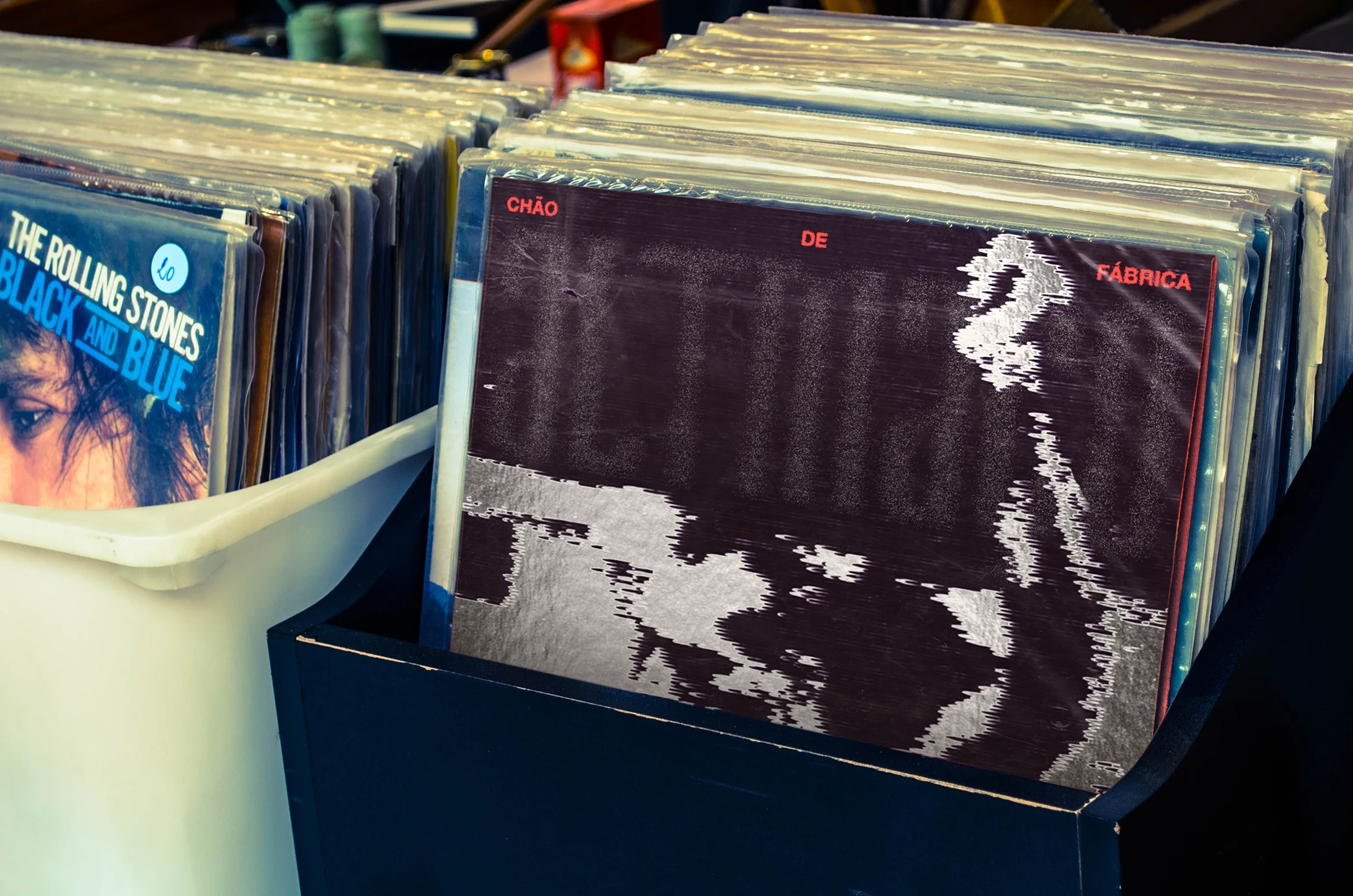
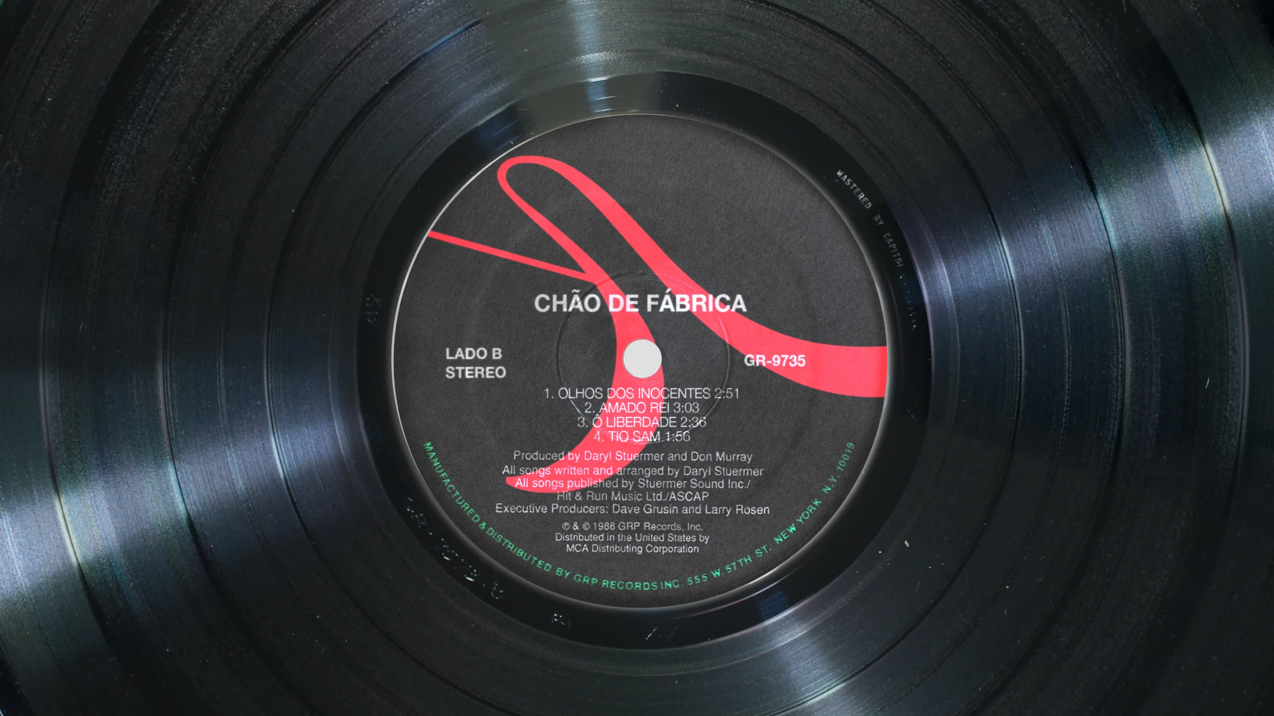
Myself and Matheus Pacheco developed the visual identity for AltMaço’s first album, Chão de Fábrica (factory floor), shaping a system that reflects the band’s position between past and present. Formed by Latin American immigrants living in Europe, the band draws from the legacy of Brazil’s 90s and 00s hardcore scene, translating its raw energy into a contemporary visual language that exists across contexts. The project merges references from tropicalist psychedelia to Seattle-driven distortion. The band flirts with each of these styles to build its own language and communicate with today’s times, revitalising the movement with a touch of youth.
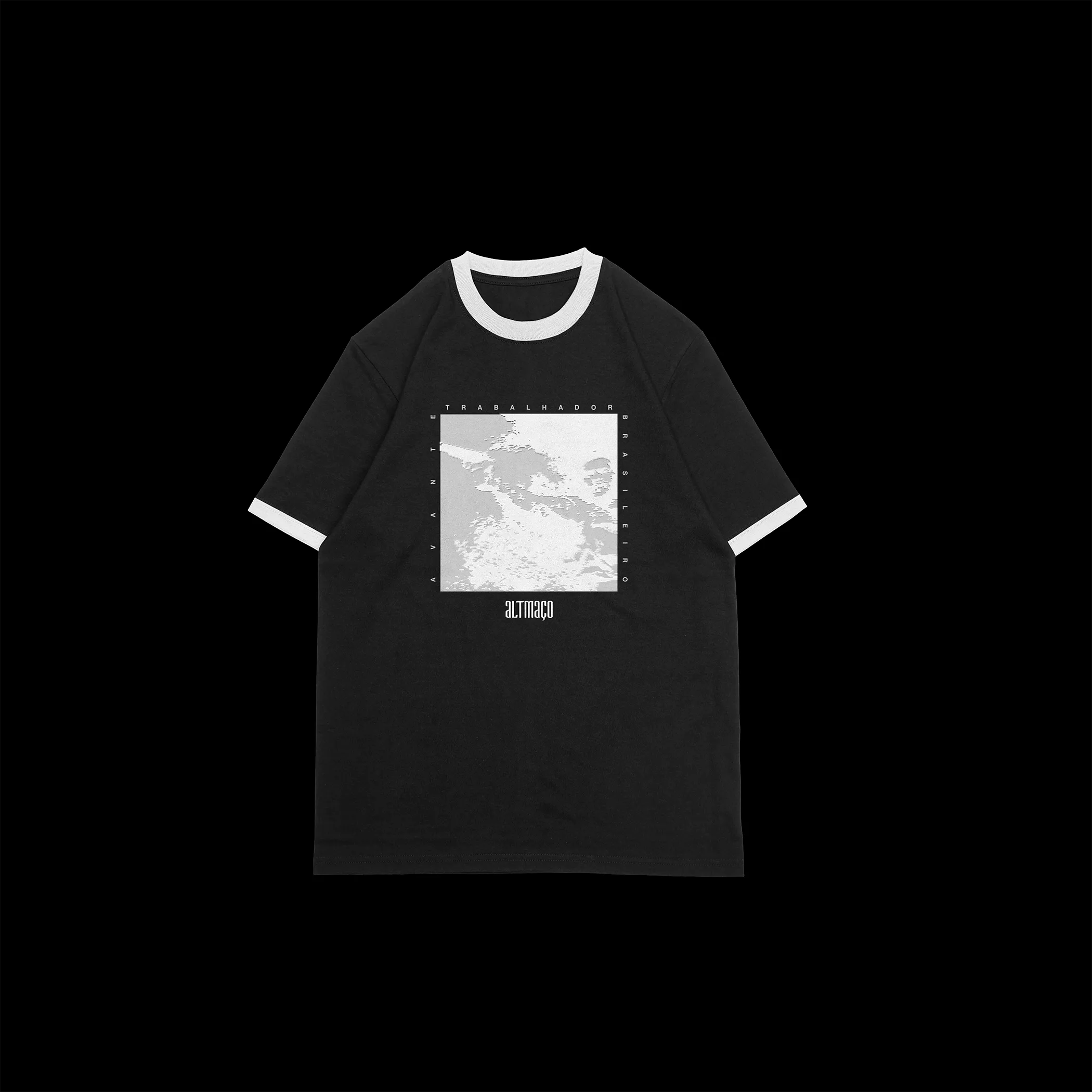
Our role was to define a direction that could hold these layered influences while introducing a sense of urgency and renewal. The identity is built through generative processes, using creative coding (Processing) to construct and evoke revolutionary figures. These visuals operate in constant transformation, suggesting erosion, resistance, and the instability of capitalism over time.
The project extends beyond aesthetics, engaging directly with the themes of the band’s first album. It reflects on capitalism as a structure that shapes behaviour, health, and perception, embedding ideas of consumption and labour exploitation into everyday working life. It also addresses the importance of working-class organisation to fight for better living conditions and rise against the logic of social inequality as a pillar of society. Through this lens, the identity becomes a space of first call, where visual form and political narrative intersect to question existing conditions and point toward collective action.
2023 / DeMiranda®
Design: Lucas DeMiranda, Matheus Pacheco

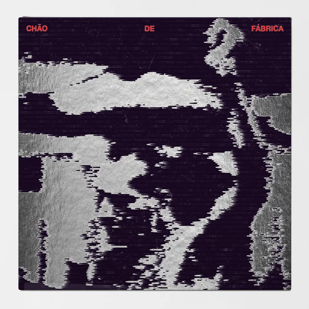
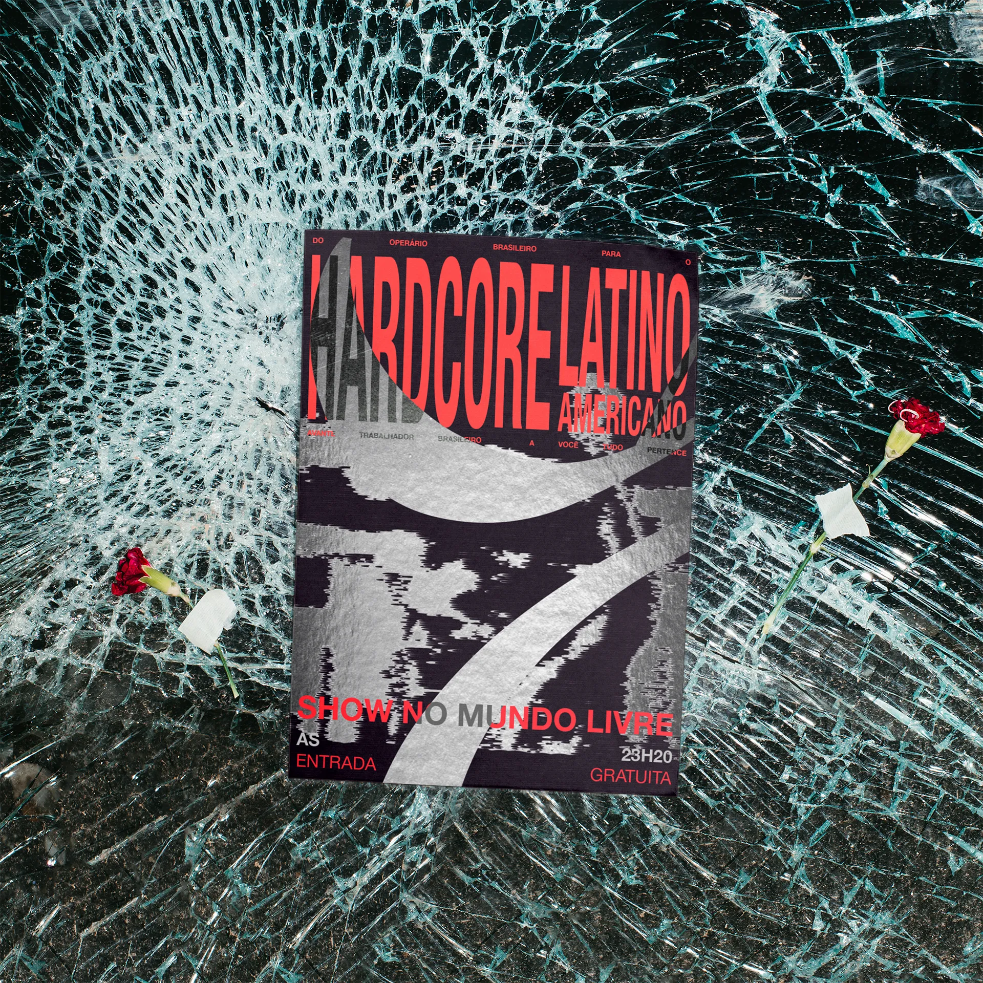
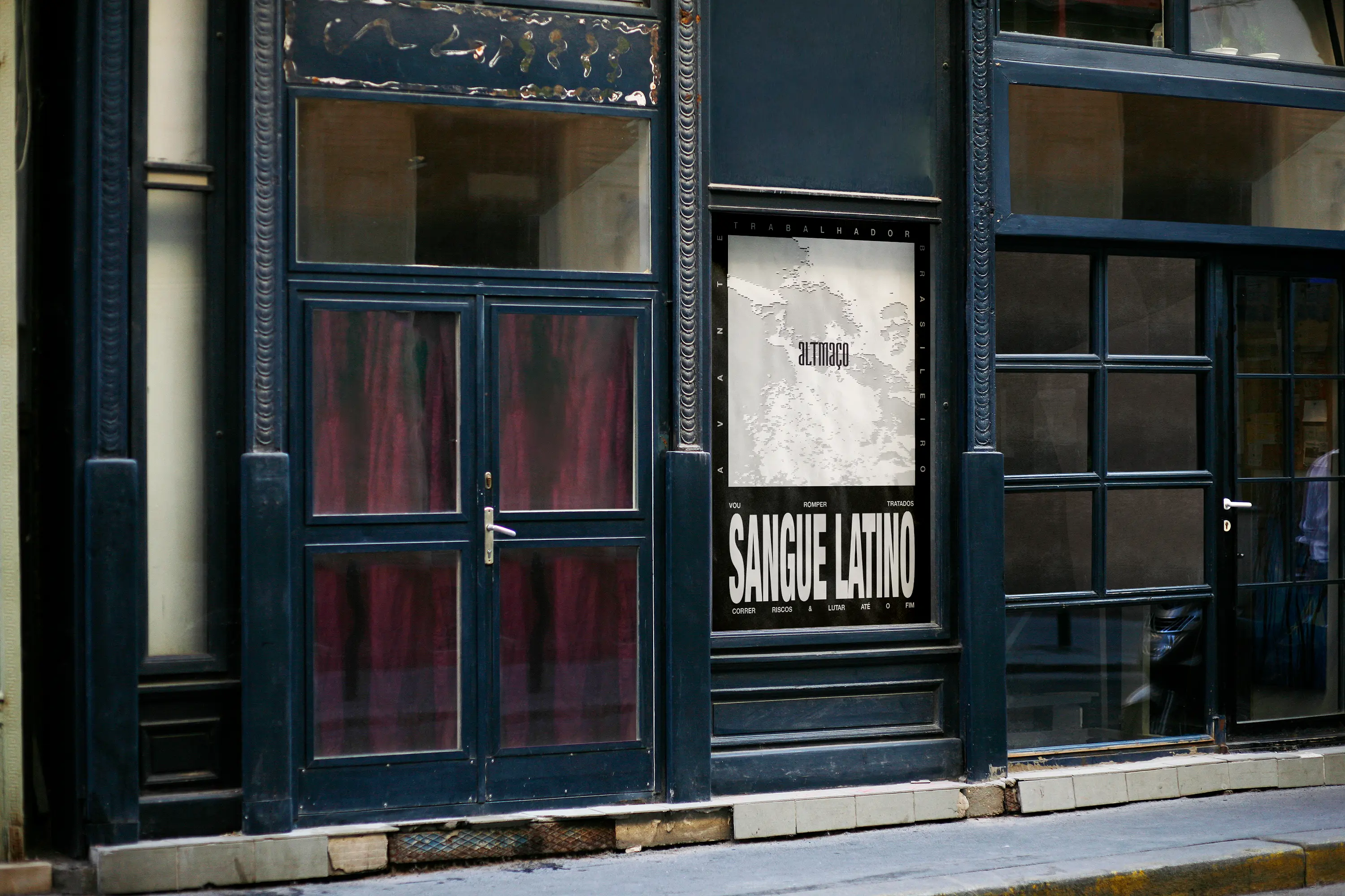
The visual language draws from political graphics and protest imagery, reinterpreting them through a generative design system. Symbols of resistance, typographic urgency, and fragmented compositions are used to echo collective movements. This approach allows the identity to carry visual confrontation and awareness, translating the band’s message into a graphic system that feels both immediate and evolving.
This language is also destabilised through distortion. Elements shift, break, and recombine, reflecting the revolutionary message embedded in the album’s themes. Rather than presenting fixed statements, the system operates in flux, reinforcing ideas of struggle, work exploitation, and revolution while inviting the viewer to actively engage with its meaning.